
MVP Mobile App For ElevateMe
ElevateMe is a science-backed, hormone-free platform that helps women navigate the challenges of midlife with confidence and clarity. By turning wearable health data into personalized, actionable recommendations, it empowers women to better manage symptoms like brain fog, sleep disruption, and hot flashes, while supporting overall well-being without relying on hormones.
Date
2025
Team
UX UI Designer (Freelancer)
Diana Agronov
Product Manager (CEO, Co-founder)
Tali Kamer
Development (CTO)
Guy Ezra
Helping women navigate perimenopause with AI-powered insights from their health data.
Scope
The client defined the first phase as a proof of concept, released to a small group of 50 women. The goal was to gather real usage data, since few comparable products exist, while providing a foundation for pitching to investors and pharmaceutical partners.
My role was to translate this focused, cost-constrained scope into a clear and usable app experience, prioritizing only essential features and ensuring the design could validate the concept without overcomplicating the build.
The Challenge
The biggest challenge was designing an AI chatbot as the main entry point of the app in a way that felt supportive and natural, rather than robotic or forced. Because the chatbot shaped the majority of user interactions, its tone and behavior needed to align with the product’s wellness-focused identity.
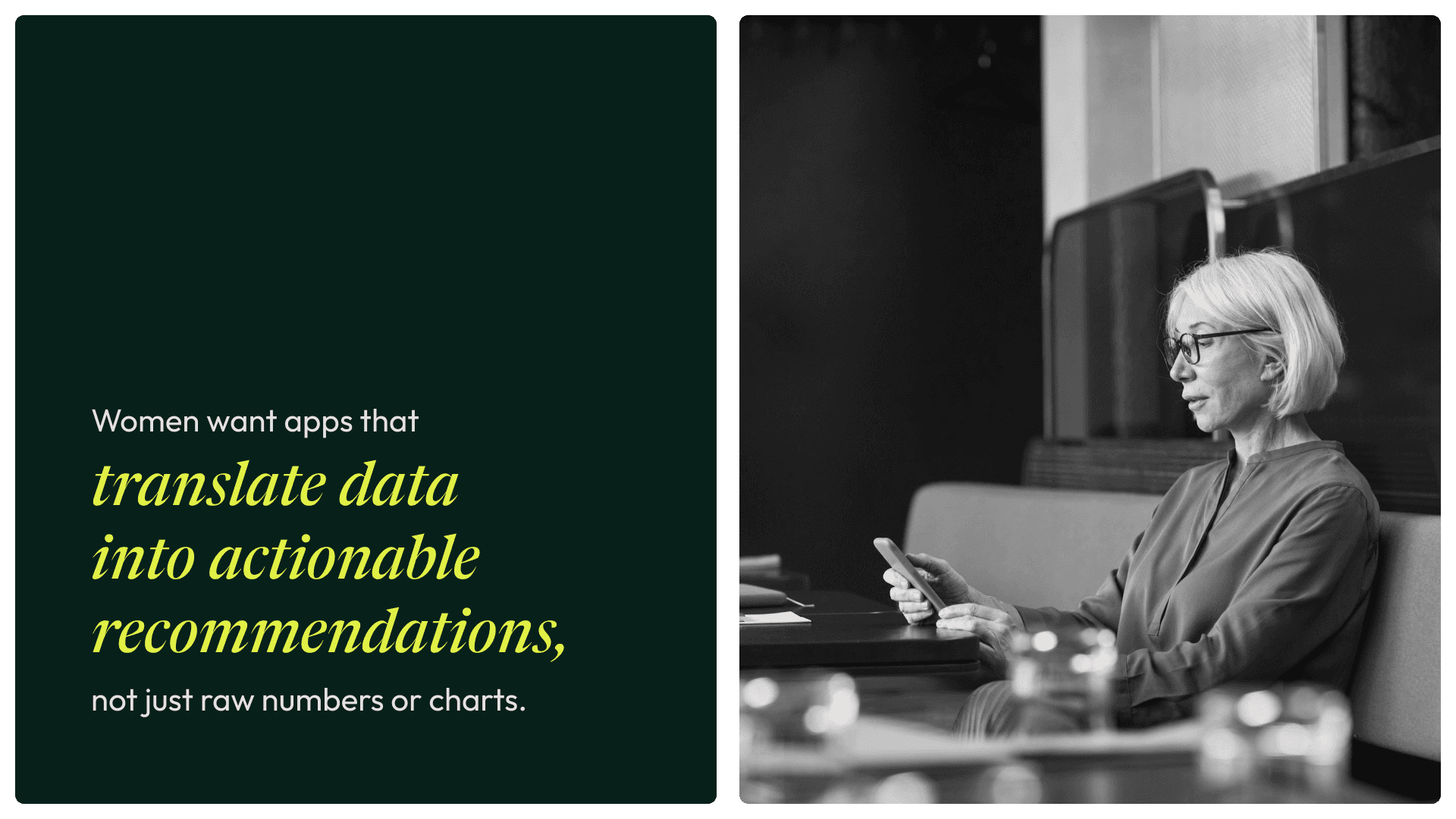
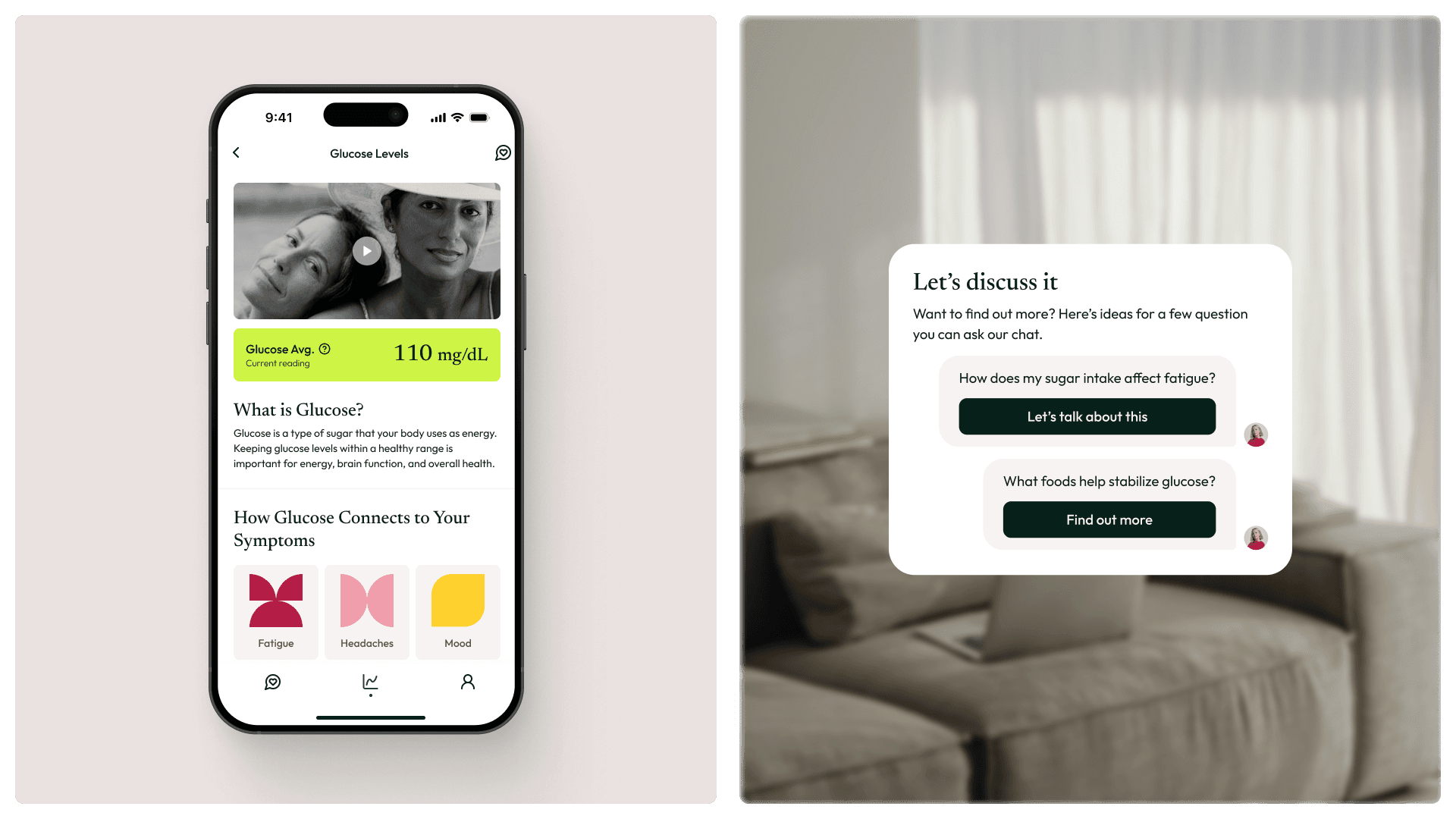
Another challenge was making health data feel useful without overwhelming users. Instead of showing raw charts or graphs, we had to translate wearable metrics into clear explanations, insights, and actionable suggestions - bridging the gap between data and everyday decision-making.
Finally, engagement and retention were critical. We explored gamification as a way to reward consistent use, but for this first phase we intentionally held back to keep logic and scope manageable. This meant finding more subtle ways to communicate that the more you use it, the more you benefit.
Research & Insights
Design Process
Exploration - Insights Screen
How can we stay true to our mission while keeping development lean for the first phase?
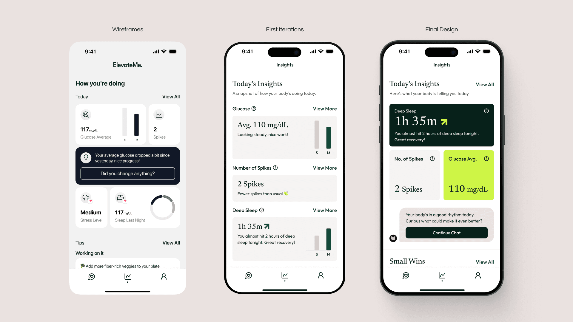
Two of our main challenges were finding a balance between being less data-heavy and encouraging ongoing engagement. These guided the concept behind the Insights screen.
From our research, many women mentioned that other wellness apps often show “a bunch of numbers” without explaining what they actually mean for their body. We wanted to change that.
The Insights screen gives each user a quick, personalized snapshot of her most relevant data, for example, showing sleep quality after waking up or highlighting a glucose spike after lunch. The goal was to help her connect the dots between actions and how she feels.
To make this data more actionable, we added a direct entry point to the chat, allowing users to dive deeper into their results or ask for recommendations.
While we had many more ideas for this screen, we intentionally kept it focused for this POC phase, ensuring a strong foundation before expanding further.
Bringing ElevateMe to Life
After weeks of exploration and iteration, I shaped the first working version of ElevateMe; a clean, approachable app that transforms complex health data into daily guidance. The experience was built around simplicity, trust, and engagement, focusing on three key areas: onboarding, the AI chat, and the personalized Insights screen.
For this first release, our goal was to build a solid foundation. Something functional, testable, and easy to expand later on.
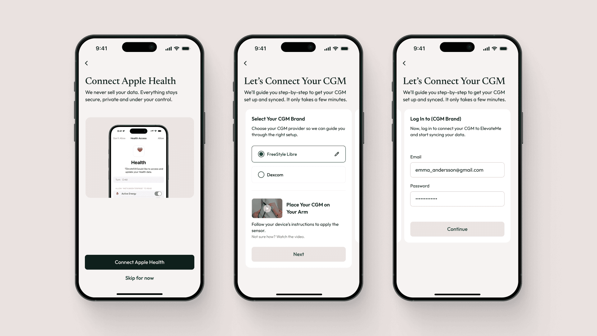
The onboarding flow guided users to connect their Apple Health and CGM device, both essential for gathering meaningful data. Without these integrations, the app couldn’t deliver personalized insights, so we designed the setup to feel seamless and purposeful rather than technical or tedious.
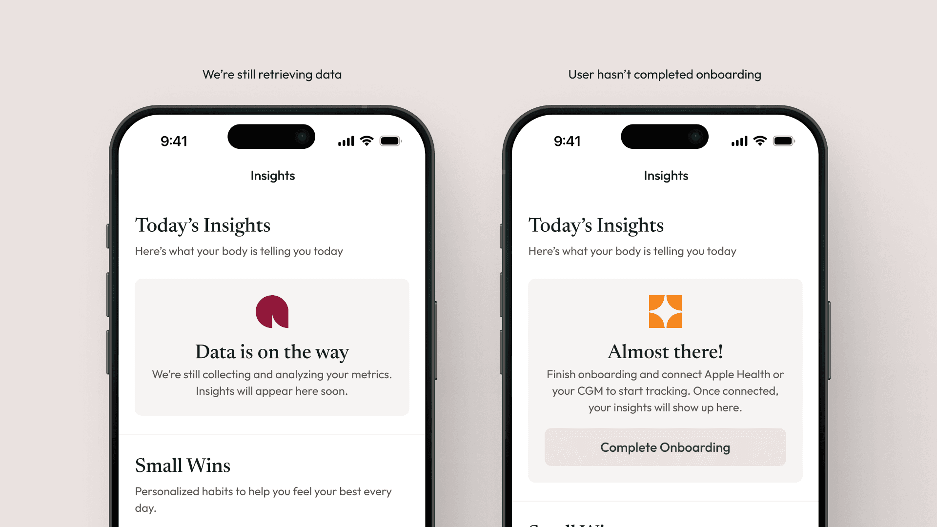
I also created thoughtful empty states for situations where data wasn’t yet available. For example, if onboarding wasn’t finished or the system hadn’t collected enough data. These moments reassured users that the app was “learning” from them, not just empty.
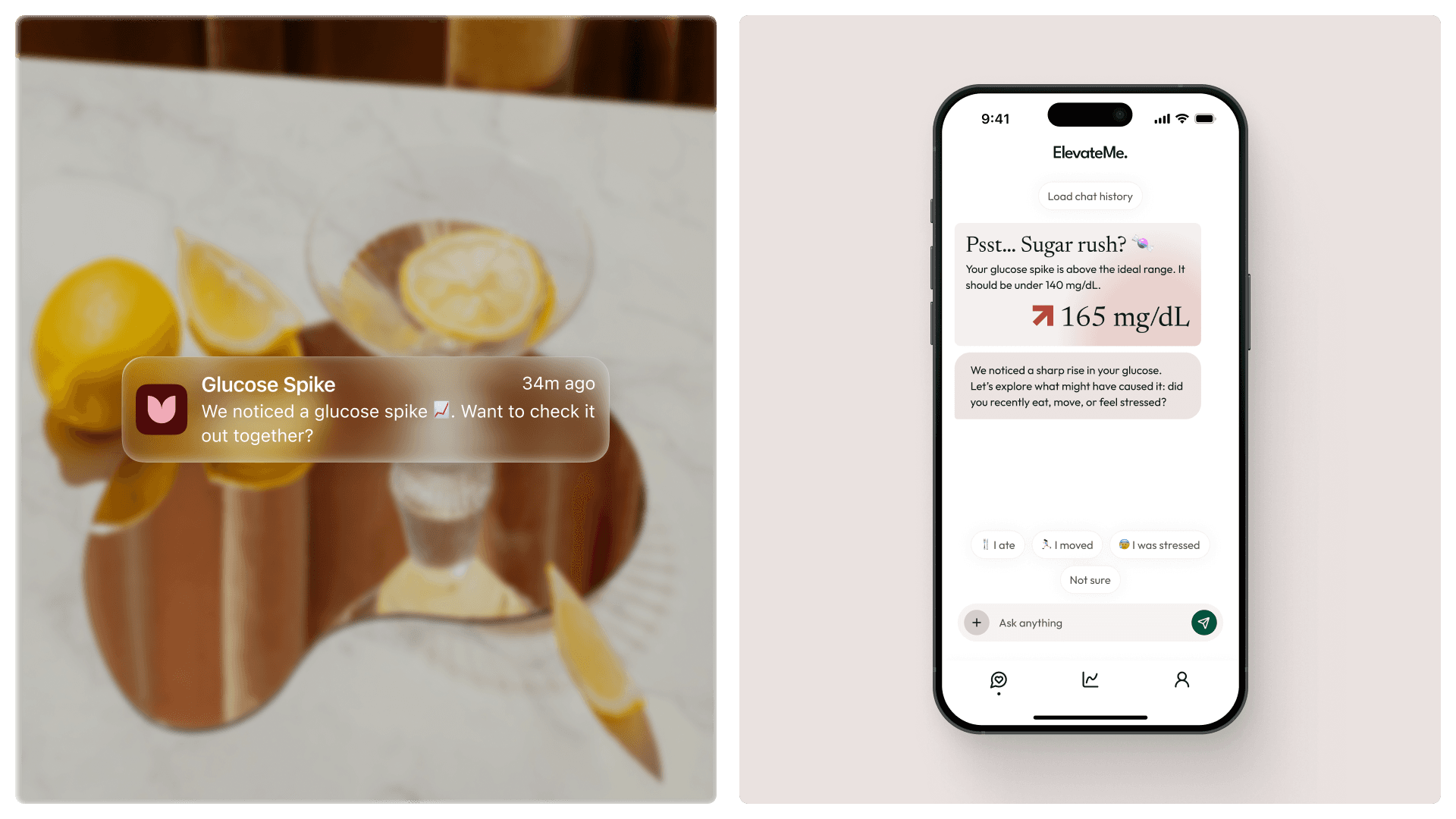
To keep users engaged, we introduced a notifications system that alerted them to any meaningful changes, such as spikes or dips, and encouraged them to open the chat for deeper insights or personalized recommendations. This helped reinforce the idea that consistent use leads to greater awareness and positive habits.
Back to the Insights Tab
The client’s goal was to help users stay curious and informed about their own bodies, learning from their data, understanding how habits impact symptoms, and seeing how everything connects.
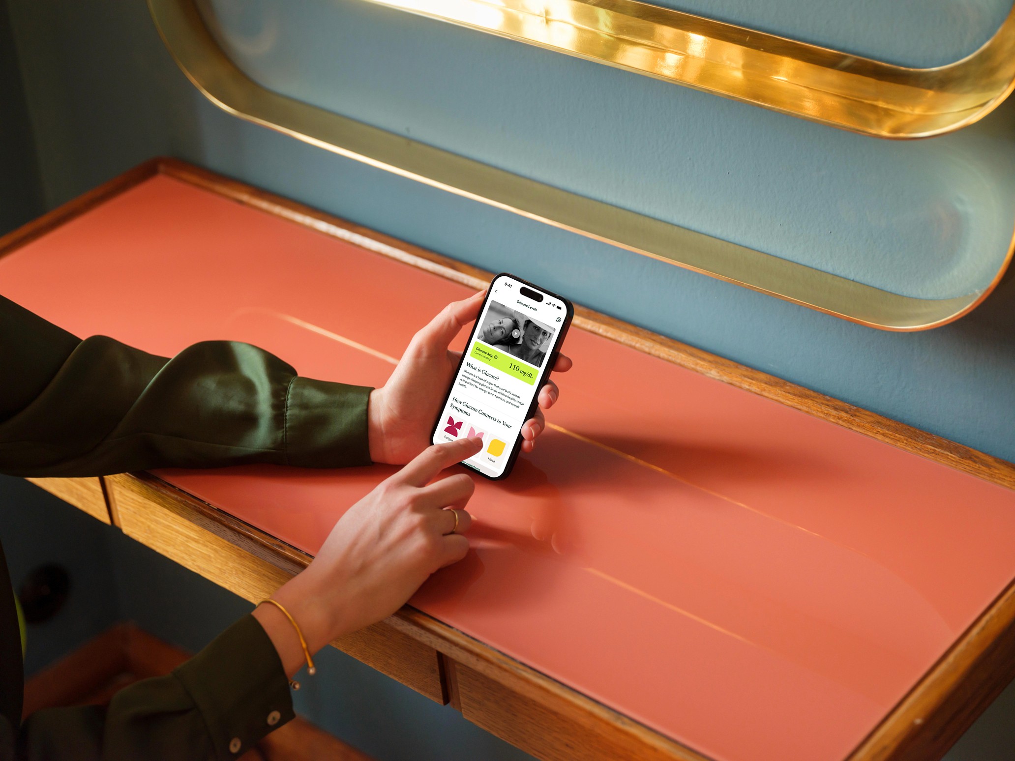
The Insights tab gave a clear overview of the user’s most relevant data, along with her current habits and suggested improvements.
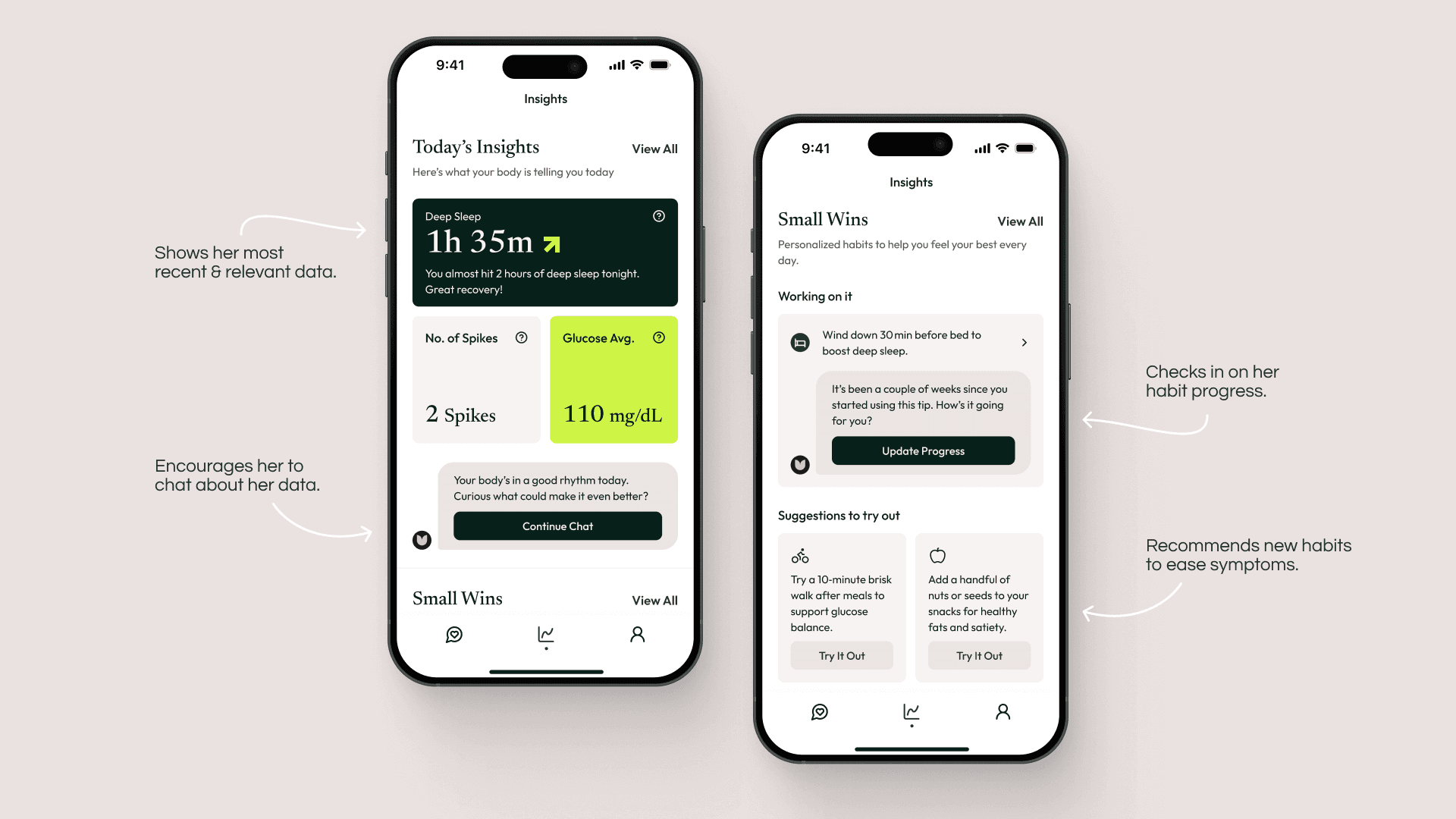
Each data point also linked to a “Learn More” screen, designed to educate users on topics like how glucose levels influence energy, mood, or sleep: helping turn information into real understanding.
What's Next
The project is currently in development and entering its QA stage. Valuable insights and user data will soon follow, and I’m excited to see ElevateMe reach its first users, helping the team grow their product, reputation, and brand.
Working on this project was a deeply rewarding experience, and I’d love to be involved in more projects like this, where design and science come together.

